The visual system behind Team SHFT. Colors, typography, logo usage, and the design principles that define our identity. Printing something for us? The production files are in downloads.
--color-bg
Primary backgrounds, content areas
--color-surface
Alternate section backgrounds, cards
--color-surface-alt
Dark sections, text primary, footer
--color-text-secondary
Secondary text, descriptions
--color-text-muted
Labels, captions, tertiary text
--color-border
Borders, dividers, subtle separators
--color-accent
Primary accent, CTAs, highlights, marquee
--color-accent-hover
Hover state for accent elements
Primary text on white
Secondary text
Muted text
Primary text on dark
Secondary text on dark
Muted text on dark
Text on accent
Secondary on accent
ABCDEFGHIJKLMNOPQRSTUVWXYZ abcdefghijklmnopqrstuvwxyz 0123456789
Team name (SHFT), display headlines, section numbers, big statements. NEVER for body text. Always uppercase. Weight 700-900 only.
ABCDEFGHIJKLMNOPQRSTUVWXYZ abcdefghijklmnopqrstuvwxyz 0123456789
Section headings, subheadings, button text, nav links, labels. Always uppercase for labels/buttons. Weights 500-700 for headings, 600-700 for UI.
ABCDEFGHIJKLMNOPQRSTUVWXYZ abcdefghijklmnopqrstuvwxyz 0123456789
Body text, descriptions, paragraphs, long-form content. Weight 400 for body, 500 for emphasis. Never uppercase at small sizes.
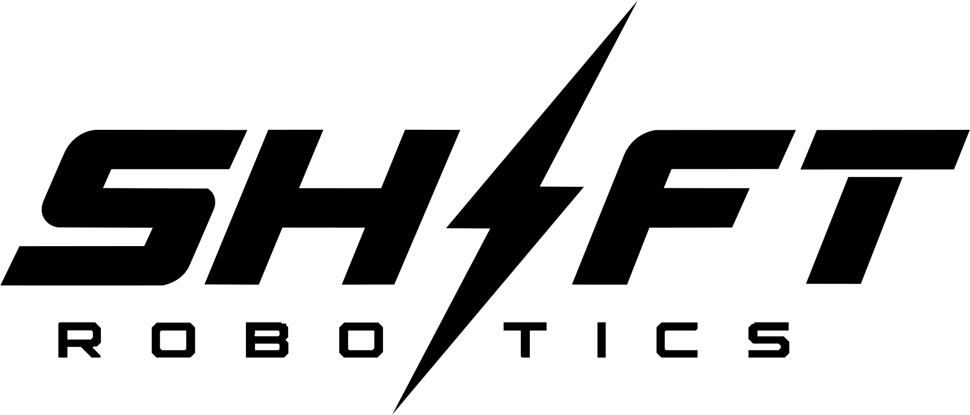
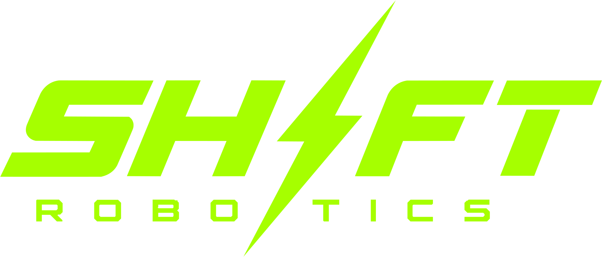
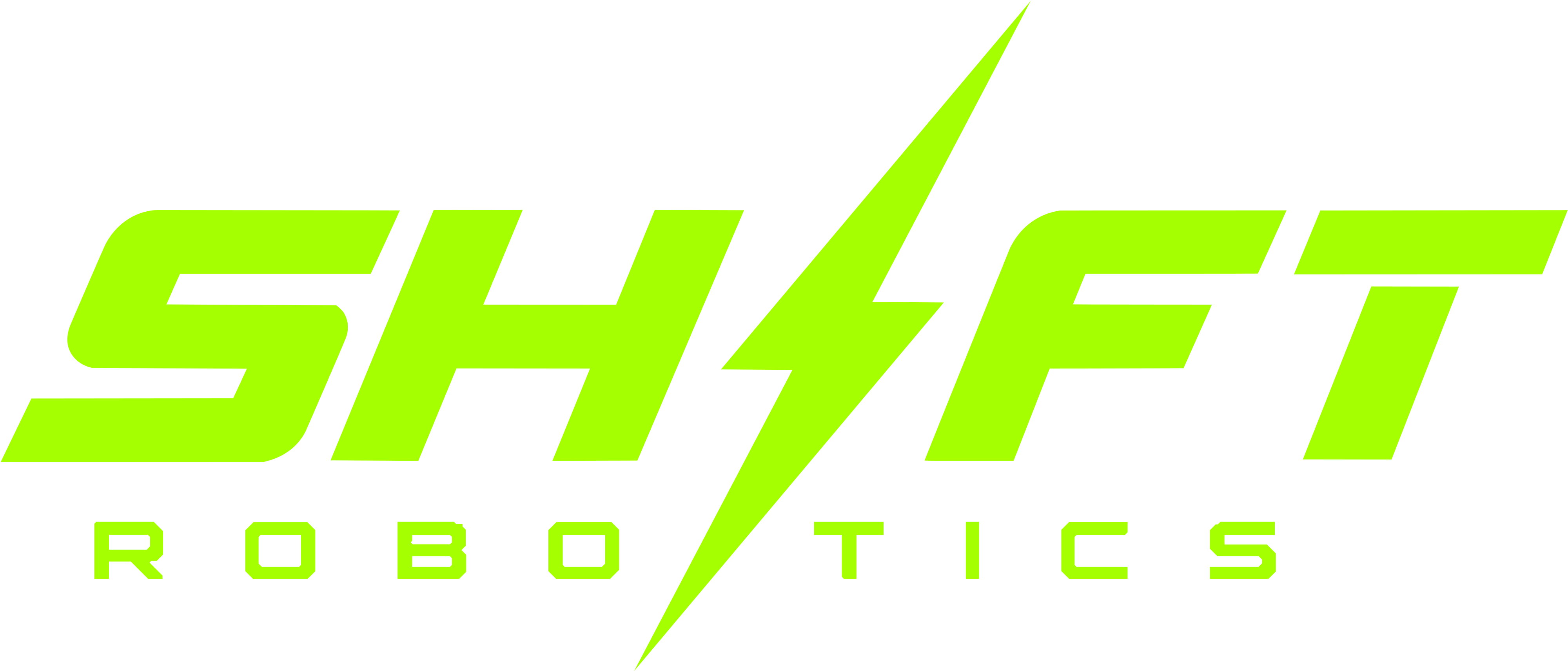
 Wordmark - On dark
  Full lockup - On dark
  Bolt - On dark
  Wordmark - On light
  Full lockup - On light
  Bolt - On light
 The default mark.
Where the full team name has to read.
Small placements and avatars.
Keep space on all four sides equal to a quarter of the mark's height. Nothing goes inside that area: no seams, no other logos, no trim, no type.
80px wide 24px tall The wordmark stops reading below 80px wide and the bolt below 24px tall. Where the full lockup would land under the wordmark minimum, use the wordmark on its own. Print and stitch minimums are in downloads.
The angular arrow mark that read as an "S" is no longer part of the identity, and neither is the version of it set inside a green circle. If you have it on file, replace it with the bolt. Artwork carrying the old mark is out of date.
Production files for anyone printing, stitching, or cutting the SHFT logo. Take the whole pack or pull the one file you need.
Three marks, five colorways each, as vector and high-resolution raster. Everything is trimmed to the artwork, so sizing by width or height gives you the size you asked for. The pack includes a one-page spec with colors, minimum sizes, and clear space.
ZIP · 1.3 MB · 60 files
The green sits outside the CMYK gamut, so four-color process comes out duller than screen. Match to a spot color where you can. C35 M0 Y100 K0 is a starting point for process, but check a proof. We have no verified Pantone or thread number on file yet. If you pick one, tell us and we will record it so the next run matches.
| Stitch | ||
|---|---|---|
| Wordmark | 50 mm / 2 in | 90 mm / 3.5 in |
| Full lockup | 75 mm / 3 in | 130 mm / 5 in |
| Bolt | 15 mm / 0.6 in | 25 mm / 1 in |
Print covers screen print, DTF, and vinyl. The lockup needs more room than the wordmark because ROBOTICS is small and letterspaced. Below the stitch minimum, drop the ROBOTICS line and use the wordmark on its own. Keep clear space on all four sides equal to a quarter of the mark's height.
Need a format that is not here, a specific placement size, or a proof checked before the run? Email team@shftrobotics.com.
Where each mark goes on each item, and how big. Every diagram uses the production file from the pack above.
10 - 11 in Tee - Full front Centred. Top of the mark sits 3 in (7.5 cm) below the collar seam on an adult M.
3.5 - 4 in Hoodie - Left chest Wearer's left. About 7 in down from the shoulder seam and 4 in in from centre.
12 in Hoodie - Full back Centred across the upper back, below the shoulder seam.
2 - 2.5 in Cap - Front panel Centred on the front panel. Keep the cap all black so the green carries.
 2.5 - 3 in Sticker or patch - Contour cut
 Cut to the bolt silhouette, or set the bolt on a black field. A 1.5 in mini works for helmets.
~60% of width Pit banner - Centre Centred on a 6 ft x 3 ft banner. Team number and site sit in a small strip along the bottom.
11753
Sets in Orbitron Black, uppercase. It is ordinary type rather than custom art, so you can set it yourself. Never draw it into the wordmark and never let it replace the bolt.
INNOVATE. ADAPT. SHFT.
Set in Orbitron, uppercase, with the periods. It is type, not art. Keep it to one line.
These are placement diagrams, not photographs. Each one uses the same vector file you download above, so the art here is the art in the file. Sizes are for an adult M; scale proportionally for other sizes, or lock one placement to M if your shop runs a single screen. If a placement you need is not here, ask before the run rather than after: team@shftrobotics.com.
Angular geometry, no rounded corners, aggressive crops. Every edge is intentional. Softness signals uncertainty - we don't do uncertain.
border-radius: 0 Let white space do the work. Color is accent, not background. The neon green earns attention by being rare, not everywhere.
bg: #FFFFFF Every animation serves hierarchy. Nothing moves just to move. Reveals communicate order of importance. Speed communicates confidence.
ease: expo.out Typography carries the brand. When in doubt, make the text bigger. Orbitron for impact, Exo 2 for authority, Raleway for clarity.
font-weight: 900 Focus. Elevate. Innovate. Together.